Ibrahim Al Shanifi for Trading and Contracting Company was established in 1977 by Mr. Ibrahim Al Shanifi. In 1984, the company specialized in the confectionery trade. The legal form of the company was changed into a limited liability company in 2014. Currently, the company specializes in importing and trading edible products, with the main focus on confectionery products such as cake, biscuits, snacks, juice, and jelly.
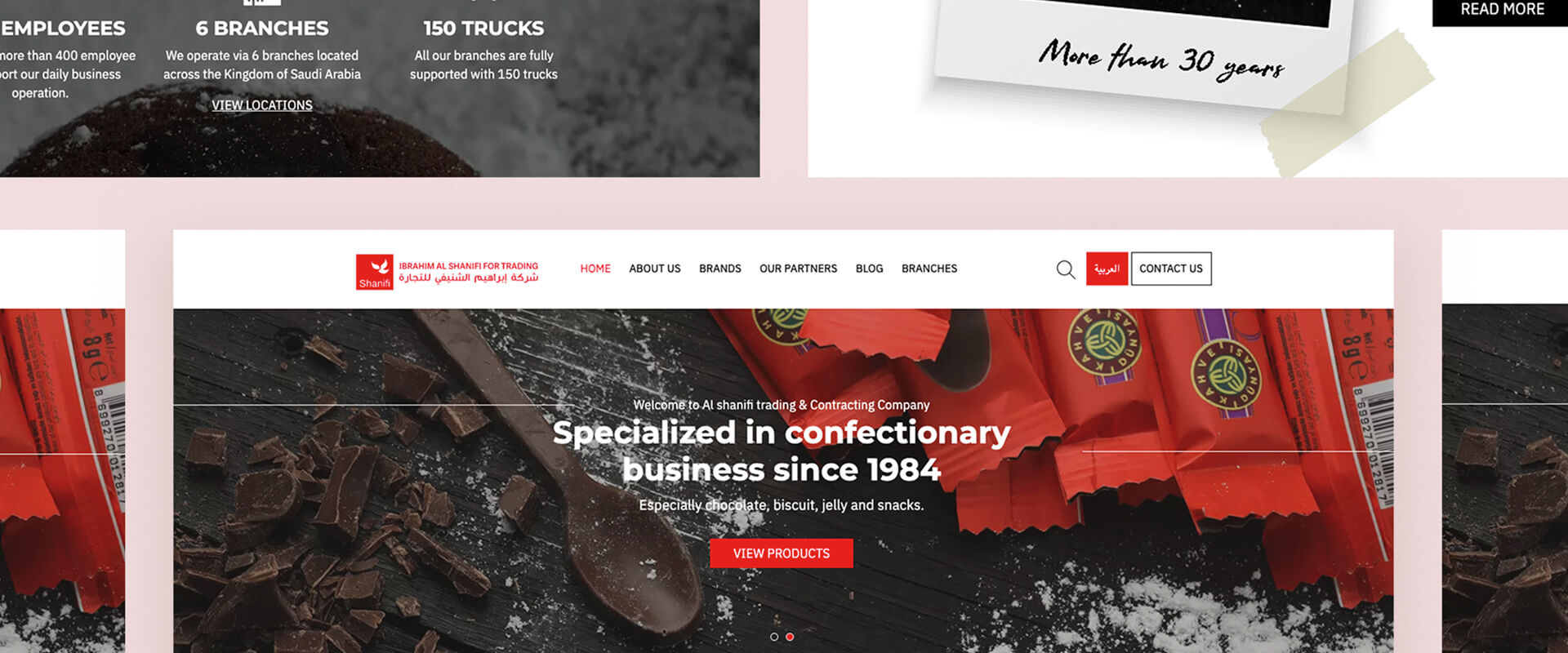
Ibrahim Al Shanifi for Trading and Contracting Company operates in the Saudi market covering all regions of the Kingdom via 6 branches located across Saudi Arabia, and through all market channels.
When Al Shanifi for Trading Company approached us, the brand already had a fantastic foundation on which to build. The client was able to work with us to set a more visual experience for Al Shanifi for Trading and Contracting. Together we came up with a better overall experience in presenting and exploring products, which centralized the content and made it pleasurable and easy to navigate. They wanted to make sure that visitors and clients could easily find what they were looking for and get to know more about the brand at the same time.
The development and design of the service were quickly refined with the client and the end-users. We produced the visual concept, interface, layouts, and color choices. Once my client was happy with every page on the site, we were all set for handover!
At the handover stage, our design & development team pulled together all of the new design elements they have created – in this case, we had some backgrounds, a social sharing icon and the products' graphics – and shared them with the client. On the other hand, the content team started to create content that meets the desired tone so that the new website would picture the brand in the right way.
By the time the site was completed, both the team and the client were very happy with the final product. Visually, it represents the business well and showcases the best of their products and services to potential clients.
The color palette (Red, White and Black) enhances and draws the focus to the colorful products the site showcases.
Red is associated with meanings of love, passion, joy, strength, leadership, and determination. Red is daring, energetic, enthusiastic and exciting. It is a popular logo design choice because the color attracts attention. When you see a glimpse of the red hue, you become interested in the logo. Studies show that the color red can create powerful physical effects. This includes increased metabolism and blood pressure. For food logo design, looking at red imagery can boost your appetite!
White in the background portrays feelings of cleanliness, purity, and simplicity. White is most effective when used as a base color, which works well when complemented with other accent colors like red.
Black signifies elegant, sleek and high-end. Shades of brown are warm, appetizing, wholesome, and natural. While Grey stands for professionalism and practicality. It can also be efficient and corporate.


Sign up below to get the latest from Smarttouch Ads, plus exclusive freebies, directly to your inbox every week!